• Blog
  • SHOP
  • Calendar
  • Resources
  • Support
  • Connect
  • ARCHIVE
  • Contributors
  • Find

THE BRVTALIST

Mutant Metropolitan Culture

  • Blog
  • SHOP
  • Calendar
  • Resources
  • Support
  • Connect
  • ARCHIVE
  • Contributors
  • Find

Yayoi Kusama - Infinity Theory

Now on the view at the newly opened, Rem Koolhaas-designed, Garage Contemporary Art Museum in Moscow, is acclaimed Japanese artist Yayoi Kusama's "Infinity Theory". This is Kusama's first solo show in Russia and a truly incredible feat. Visitors are immersed inside unique environments that extend from inside the museum out in to beautiful Gorky Park. 

Yayoi Kusama - Infinity Theory (2015) at the Garage Museum of Contemporary Art. 

Two of Kusama's stunning installations are Guidepost to the Eternal Space (2015) and Infinity Mirrored Room–The Souls of Millions of Light Years Away (2013). Guidepost has the audience gather inside an environment in which white polka dots on a red background cover walls and structures, forming an outlandish, surreal landscape, confusing viewers’ perception and spatial orientation.  Infinity consists of a room with mirrored walls filled with thousands of small lights, which appear as pulsating dots. These are infinitely reflected in the mirrors to create an illusory cosmos, which is experienced by a lone viewer, enabling each visitor to momentarily get lost in Kusama’s mesmerizing world. 

Infinity Mirrored Room–The Souls of Millions of Light Years Away (2013)

Also included in the show is Walking Piece (1966), one of Kusama’s earliest works.  This is a slide show which portrays the artist walking the streets of New York in a traditional Japanese kimono with a parasol.  Outside of the museum, Kusama extends her brilliance beyond the traditional gallery walls and has created Ascension of Polkadots on the Trees, a project that Kusama has shown in various public spaces around the world. In Gorky Park, trees in avenue will be wrapped in red cloth decorated with white polka dots. The museum notes that:

 Kusama’s obsession with creating works using colored dots have their roots in the artist’s psyche, wherein hallucinations have haunted her since her childhood. In her memoirs, she recalls sometimes seeing the pattern in paintings spilling over the edges of the canvas to envelop her and everything around her, dissolving her inner self in the outside world. Later, she would use this perceptual experience, which shifts boundaries between fact and illusion, the real and the imaginary, to create works in a variety of media, from drawing, painting, and installation to sculpture, video, and performance.

Kasuma is an artist that has won critical acclaim since the 1980's. Her works have been shown around the world, from Japan to Paris to New York City. Her retrospectives contains hundreds of pieces and her output continues to be prolific. We love her infusion of Japanese surrealism and cutting edge psyche into Russia's newest and most progressive museum. The fact that she is finally showing in Russia is not surprising seeing as though the country has quickly evolved into a classic and modern art powerhouse. The Garage Museum, founded by Russian businesswoman, art collector and magazine editor, Dasha Zhukov is itself an impressive accomplishment. Founded in 2008, the institution was based in a temporary pavilion in Gorky Park created specifically for Garage by architect Shigeru Ban. Just this month, the Museum moved to its first permanent home — a groundbreaking renovation of the famous 1960s Vremena Goda (Seasons of the Year) pavilion in Gorky Park — designed by famed architect Rem Koolhaas. For more information please visit Garage Museum. 

-JRS

Images courtesy of Garage Museum. *Click to enlarge. 

View fullsize infinity 3.jpg
View fullsize infinity 4.jpg
View fullsize inifinity 5.jpg

From left: Ascension of Polkadots on the Trees, Yayoi Kusama, Walking Piece

Wednesday 06.17.15
Posted by Jeremy Schwartz
Comments: 1
 

THE LAST CONSPIRACY A/W 2015

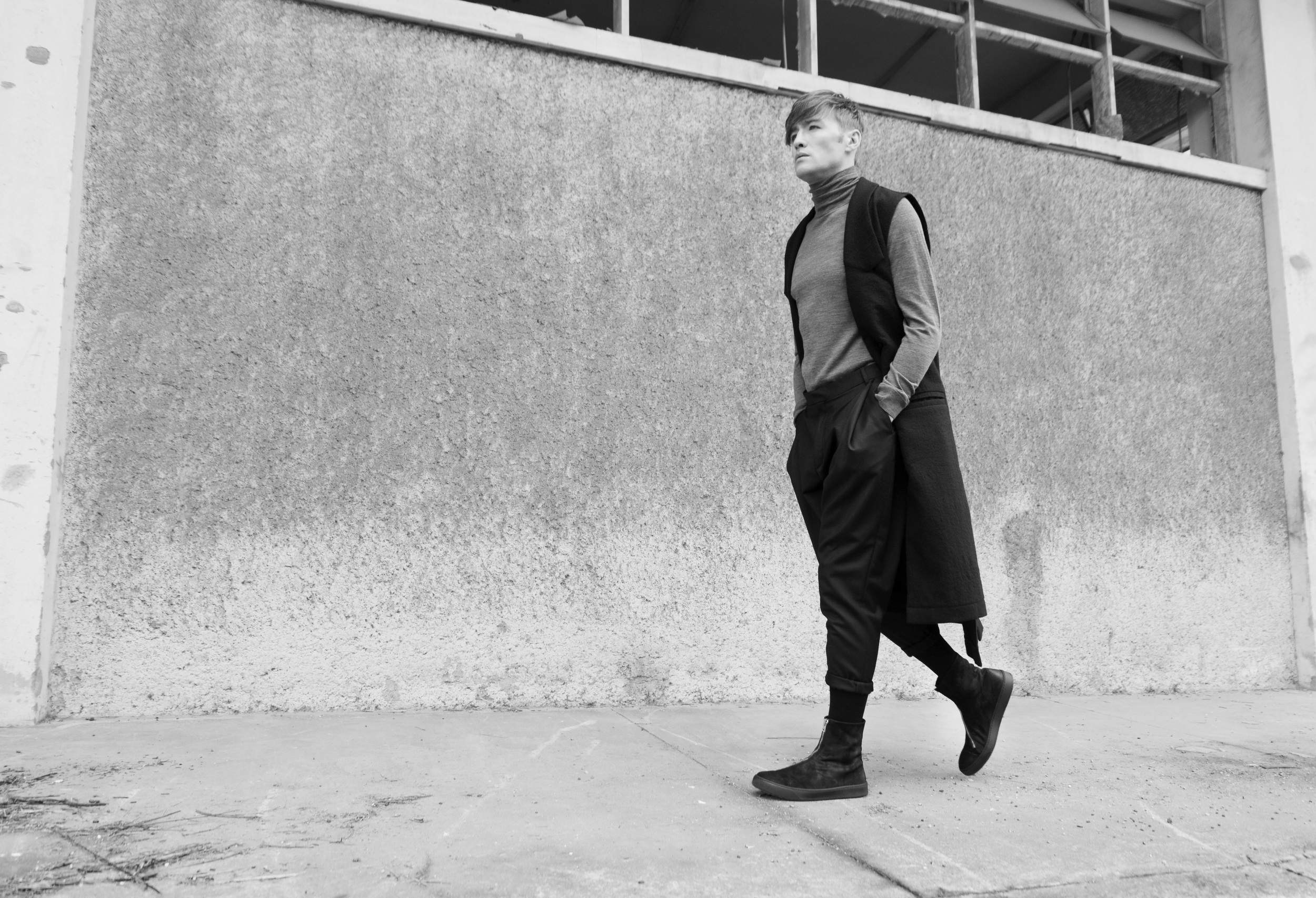
Many say the most important item you wear are the shoes on your feet. They not only serve as protection, but also say a ton about the wearer. Considered footwear is something very important to The Brvtalist. That's why when we came across Denmark-based THE LAST CONSPIRACY, we immediately gravitated toward their designs, ethos and craftsmanship. 

THE LAST CONSPIRACY set out to provide quality artisan footwear, items withstanding any test of time, imbued by the sense of history. Each pair is handmade with profound attention to details, thus imprinted with a personal connection between shoemaker and wearer. This selective process is conducted with patience, willfulness and mindful purpose. Against a contrasting backdrop shaped by a continuous dialogue between Portuguese craftsmanship and Nordic minimalism.Each collection is based on progress and a forward-thinking mentality. Authentic craftsman come first, and designers second. This creates and incredible balance of functionality and form.

The Brvtalist is honored to feature the brand's A/W 2015 collection. Staying true to previous collections while continuing to move forward, TLC's boots continue to be some of our favorites on the market today. We were fortunate enough to speak with the brand about this collection and they provided this insightful description: 

As the grayness intensifies, dark decks of clouds reach the North. Muted shadows patrol the abandoned pavements. The season of silence is here. At times like these, we observe before we react. Simply exhale and ponder. 

For AW15, THE LAST CONSPIRACY explores the foundation of the last. Centered around construction rules, this is a powerful shoemakers instrument, abreast with historic connotations. Our Nordic heritage brings forth a sense of functionality and tactile simplicity. Onto this, the discerning atelier adds knowledge, contemporary industrialism and intelligent tradition to each pair we bring forth. 

Our profound commitment to novel expression, led us to reinvigorate handmade norwegian stitching, crafty goodyear welts, asymmetric lampo zips, stern vibram soles and slightly pointed vintage lasts. Patina is restrained, underlining the sturdy durability of our trotters. To develop this further, textured natural horse and yak leathers are molded by hand, to create singular pairs, unique in their expression. For a dose of effortless chic, artisanal sneakers have been crafted, maintained in underplayed gray, deep black and crisp white.

Straightforward unrestricted advancement. Noting the unique bond between shoemaker and wearer, forged deeply over time, through sensory exploration.

The images above and below are all part of THE LAST CONSIRACY's A/W 2015 product line. The details are unrivaled and we love features like diagonal zippers and striking heels for women. All of the footwear exudes luxury, functionality and cutting-edge design, something that is not easily accomplished. We would like to thank THE LAST CONSPIRACY for contributing these images and text for our feature. Also, a special thanks to Marlo Saalmink. For more information please visit: www.thelastconspiracy.com, Facebook and Instagram. 

-JRS 

*click images to enlarge

Photographer: Lisbeth Breland Saalmink

View fullsize TLC-TaniaDSC_2588_.jpg
View fullsize DSC_4688.jpg
View fullsize DSC_4919.jpg
View fullsize DSC_5036.jpg
View fullsize DSC_2966.JPG


Monday 06.15.15
Posted by Jeremy Schwartz
 

Now Listening: Lidane Livering/Dogs of Yama - Sheltering Void

Out now on the always impressive, Copenhagen-based noise and power electronics label, Moral Defeat, is the split cassette by Denmark's Lidane Livering and Michigan's Dogs of Yama. When we first discovered Dogs of Yama, there was an instant appeal. The dark, immersive soundscapes inspired by ancient funeral practices is some of the most unique and encapsulating material in the industrial, noise and black metal genres today. After being introduced to Lidane Livering, I understood why this split would be one of the most powerful and brvtal cassette releases all year.

Sheltering Void contains 7 total tracks (4 by Livering and 3 by Yama) of post-indstustrial, blackened sonic landscapes. Livering's side begins with a slight rhythmic approach before slowly sliding in to the depths of dark, harsh environments. "Final XVIII" is an incredible journey into post-apocalyptic ambient and the perfect way to end the side and prepare for Dogs of Yama. "Kalaratri" greatly exemplifies Dogs of Yama's approach to composition as it provides an absolutely punishing environment while maintaining a somber, almost quiet feel. Finally, the elegant harshness of "She Who is Death" rounds out a stellar release. Moral Defeat continues to put out some of the rawest, most interesting emerging talent in the noise and dark electronics genre.  Pick this up now. 

For more information please visit: https://www.facebook.com/moraldefeat, https://www.facebook.com/lidanelivering, https://soundcloud.com/per-najbjerg-poulsen, https://www.facebook.com/pages/Dogs-Of-Yama/1564732430464711, https://soundcloud.com/dogs-of-yama

-JRS 

View fullsize mdef11.jpg
View fullsize moraldefeat.jpg


Thursday 06.11.15
Posted by Jeremy Schwartz
 

øjeRum - The Forest Is Sleeping Within The Trees

The Brvtalist is proud to present a new series of works by Copenhagen-based multi-discinplanary artist øjeRum (Danish compound meaning "eye room").  øjeRum practices in the fields of collage, recorded music and writing. However, it was his latest collages that caught our eye. "The Forest is Sleeping Within The Trees" is a set of four pieces that powerfully convey moods and emotions. As in many of his works, these collages represent the idea of looking inward to achieve tranquility.  øjeRum constantly strives to reach a certain feeling of simply being present in the world – fully exposed to impressions, memories and feelings.  The figures in his collages often seem to be lost in thought, as if they were contemplating their very existence. That is why they often have downcast eyes. 

Pain

I spoke with øjeRum about his works and asked him to contribute a few words on his concept, process and materials. Here is what he had to say: 

The way I see it, existence is steeped in a fundamental feeling of foreignness; of not belonging. This is the feeling I'm trying to express. By it's very nature such a feeling contains something inexplicable, something unknown and irreconciable. I'm not satisfied with my work if an assembly of clippings create a symbolism that is too apparent. I want to create a sense of opaque introspection, where it is never quite clear what it all means.

All my collages are handmade and I only use original images from old books and magazines. I have this really cool large size book about trees. All the trees in the series 'The Forest Is Sleeping Within The Trees' are clippings from that book. I never plan out to make a collage a certain way though. I always start off by playing around with clippings and if things go well, a new figure begins to emerge. I like the finished collage to have a simple and coherent expression, so it's all about finding a few pieces of paper that complement each other in form and content. This often happens by chance.

I'm mostly inspired by moods and emotions in music and literature. In the latter case the books of Franz Kafka is a source of endless inspiration. The philosopher Emmanuel Levinas has a concept called 'il y a' – the 'there is' – which he uses to express a sort of pure being. His descriptions of the 'il y a' comes very close to the feeling I'm striving for.

We love øjeRum's emphasis on elemental items. Things like rocks, trees and simple organisms are important because they are simply existing. This feeling of a tranquil existence comes across nicely in these works. They are quiet, meditative, yet very powerful. His ability to obscure human forms and shapes in nature is also uncanny. The works present a very organic entity and it becomes not about trees or forests, but more about the seemingly ambivalent nature of being as such. 

Thank you to øjeRum for contributing the images and a few words about his project. Please visit www.oejerum.dk for more information. 

-JRS 

*Click to enlarge.

View fullsize She Is The Forest.jpg
View fullsize The Forest Is Sleeping Within The Trees.jpg
View fullsize Weakness.jpg

From left: She is the Forest, The Forest is Sleeping Within the Trees, Weakness


Monday 06.08.15
Posted by Jeremy Schwartz
 

Bloom Offering - "By Your Side"

The Brvtalist is proud to premiere a new track by Seattle's Bloom Offering. "By Your Side" will be available on the upcoming release Death Bed, which is out June 22nd on End Result Productions. Bloom Offering is the solo music of multi-disciplinary artist Nicole Carr. The project began in 2012 and Death Bed follows last year's Separation Anxiety, which is receiving a second pressing from Plush Organics. Death Bed is an expansion on earlier themes of personal grief and loss. The album is about going through a painful breakup with someone you have a deep connection with. 

Death Bed is a haunting exploration of sound and emotion. We immediately gravitated toward "By Your Side" as it's an incredible composition which evokes many of the themes we've just mentioned. Bloom Offering has continued to create a masterful post-industrial gloom that incorporates multiple genres and puts traditional song structure through an experimental paradigm. Carr's vocals are the perfect accompaniment, adding dream-like elements over dark industrial synths that creates a powerful resonance. 

We are pleased to feature such a great project by an artist whose sound and aesthetic we very much admire. Death Bed is out in limited quantities on June 22nd and you can pre-order the cassette at End Result Productions. For more information and music from Bloom Offering please visit the following: TUMBLR FACEBOOK INSTA SOUNDCLOUD. 

-JRS 

View fullsize 11349044_10204790671462603_299792483_n.jpg
View fullsize death bed-2.jpg


Wednesday 06.03.15
Posted by Jeremy Schwartz
 

UY Studio

The Brvtalist is pleased to premiere the striking new ad campaign from Berlin-based fashion house UY Studio.  Released in conjunction with the latest additions to their online shop,  the campaign is conceptual, as well as daring.  

UY is an innovative brand that has grown into a full art collective, incorporating the disciplines of photography, art and home decor. UY sees no aesthetic division between him and her and  is truly unisex, hand-crafting garments that are minimal, monochrome  and architectural in form. All of the products are handmade in Berlin and UY is devoted to quality, design and affordability. We were instantly drawn to the clean lines and avant-garde ethos. 

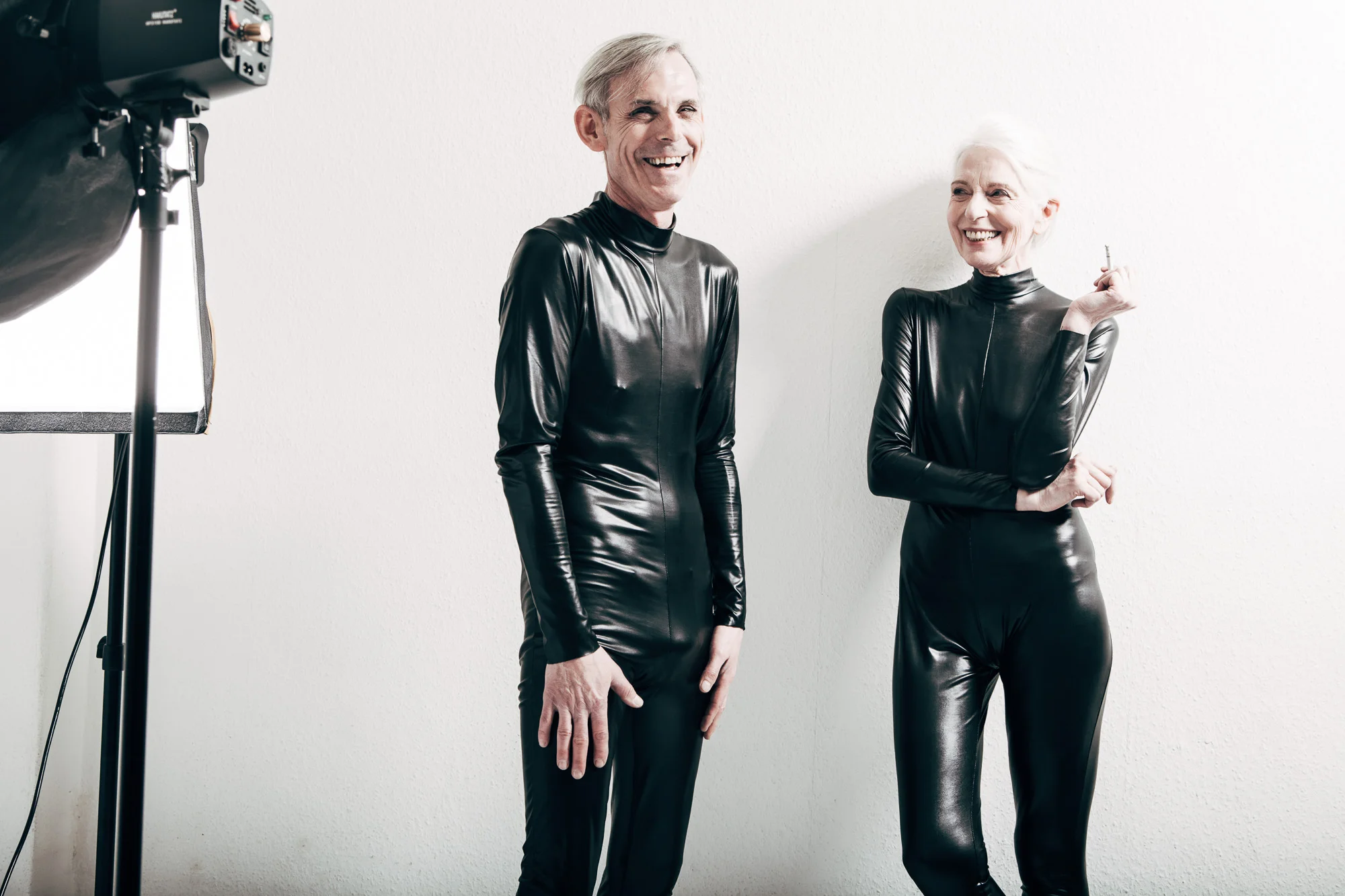
The latest campaign is an incredible example of high concept fashion that challenges traditional social and cultural norms.  We spoke to the UY design team and the inspiration behind the shoot was the idea of timeless, ageless, seasonless garments that allow the wearer to embody their own masculinity and/or femininity.  The shoot was kept very simple, as they wanted to keep it in line with previous look books and all photos were taken in their studio.  The muted background places even more emphasis on the models and gives the viewer ample opportunity for analysis and interpretation. 

We love the juxtaposition of non-traditional models with cutting edge, gender neutral design. The contours and composition of UY's garments is even more pronounced and the campaign maintains both a playfulness and sophistication. We would like to thank UY Studio for allowing us to premiere such an impressive project. The fashion house is one that we both respect and admire and we look forward to covering more of their lines. 

For more information and e-boutique, please visit their website. Also connect with them on Instgram (UY.studio) and Facebook.

-JRS

Credits:
Models: Erwin Werder, 
Model: Anna von Ruden form Modelwerk Berlin
Photographer: Jacqueline Mikuta
stylist: Erik Raynal
Assistant: Olive Brown

Click image to enlarge*

View fullsize IMG_7840.jpg
View fullsize IMG_7848.jpg
View fullsize IMG_7708.jpg
View fullsize IMG_7596.jpg
View fullsize IMG_7598.jpg
View fullsize IMG_7604.jpg
Monday 06.01.15
Posted by Jeremy Schwartz
 

VAVA Eyewear

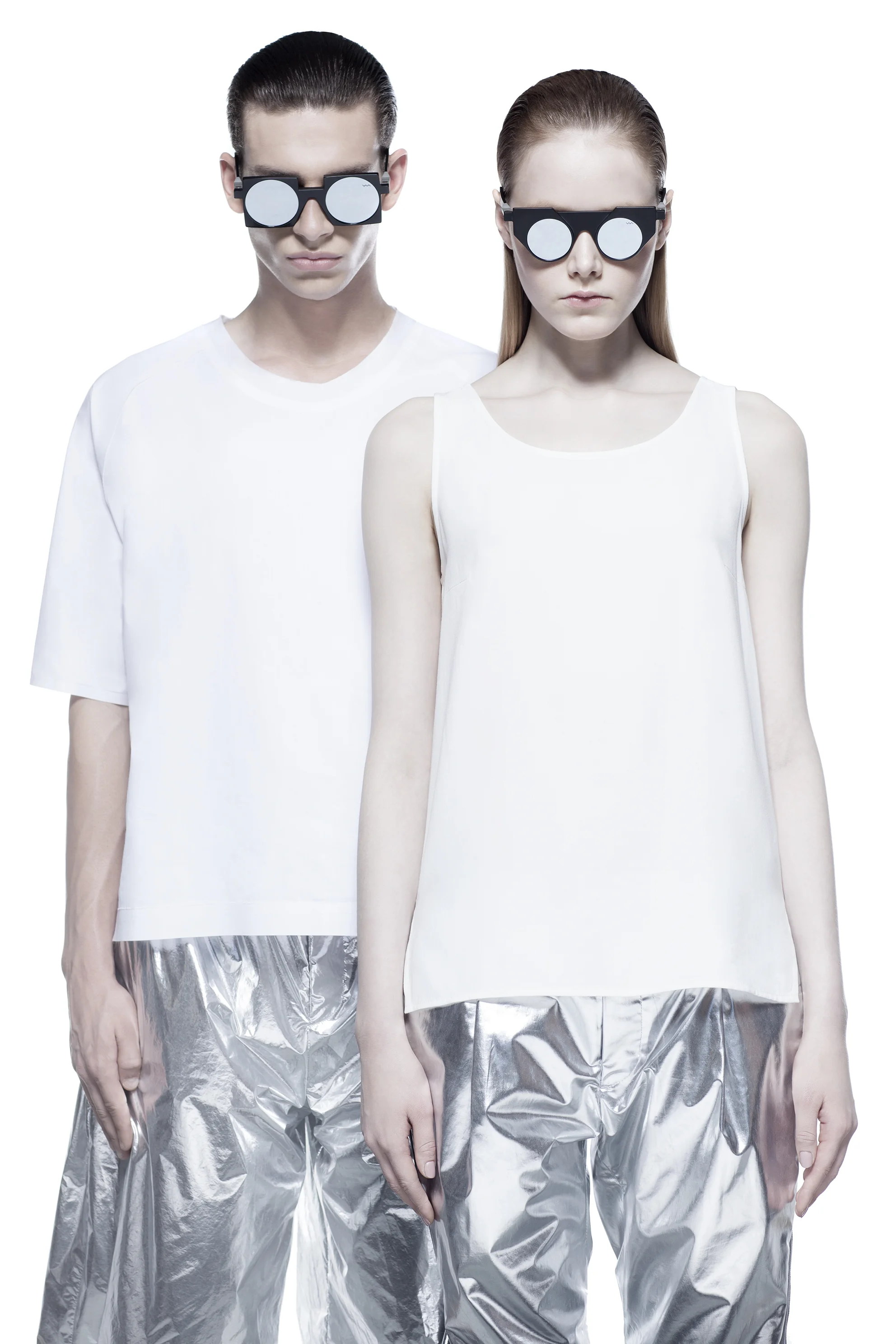
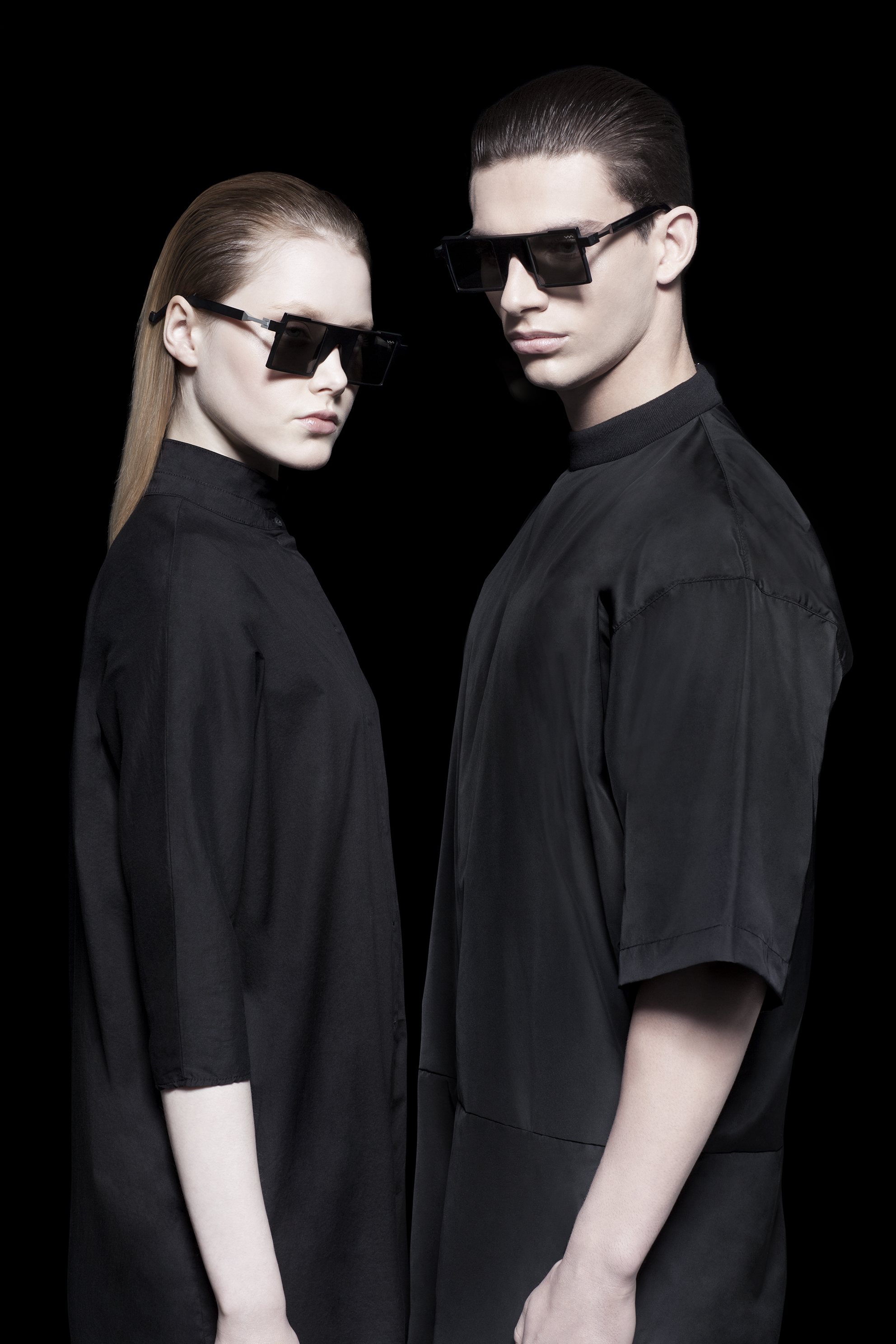
Eyewear is one of the most telling items a person can wear. What you choose to put on your face says a lot about you. There are some brands that represent pure functionality, some that represent pure luxury and others that represent something much more. VAVA Eyewear falls in to the last category. The brand's conceptual approach not only represents fashion, but materials, culture and perhaps even an ideal of the future. When we came across these striking designs, they immediately resonated with us. The unisex frames were bold and like nothing we have seen before. We also noticed the company referenced architectural forms and associated the line with Detroit, Berlin and their techno legacies. An email was sent to the brand so we could find out more. Their founder and creative director, Pedro da Silva, graciously responded and here's what we discussed: 

VAVA Eyewear Summer 2015

The Brvtalist: Let's start from the beginning. What was the inspiration for creating VAVA Eyewear? With so many eyewear brands in the field, what did you feel you had to say or show that maybe others don't? 


Pedro da Silva : I always had a keen interest in Minimalism, the interface of art and fashion, and Bauhaus. I’ve always liked basic shapes, and admired a lot artists like Sol Lewitt, Malevich or Josef Albers. My keen interest for the Bauhaus movement and minimalism goes a long way back. I wanted to develop an eyewear collection that follows the same minimalist and architectural standards. Ultimately, the aim of the brand is to achieve a contemporaneous functional look, whilst being simultaneously conceptual and timeless.

On the other hand I have been long fascinated and inspired by the Detroit techno scene and the city's post-industrial evolution. VAVA’s mission is to represent the man in control of the technological world whilst looking ahead of himself also. Everybody at VAVA lives by this philosophy, reinforcing their belief in this vision.

Finally, at a time when fashion is omnipresent and somehow random, we at VAVA believe it is necessary to re-orientate and to reacquaint what fashion should truly represent: A return to the essential requirements of design and quality. 


TB:  Who designs the VAVA line(s)? Talk about the creative process and what you try to do with each collection. 


PS: I’m the creative director of VAVA and I collaborate with 2 eyewear Designers: Giordano Cazzola and Beate Leinz. Giordano Cazzola, a multidisciplinary designer working in the eyewear industry, is based in Milan. Beate Leinz is currently based in Berlin and she worked previously as eyewear designer for Prada in Italy over 15 years.

I do not usually follow trends and fashion. I believe in style, and style never changes, just evolves. I see it more as a continuous evolution.  Actually, I like to think more about evolution, questioning / reflecting and digging / deepening. I like consistency and particularly enjoy works that are representative of something bigger. Another interesting aspect of our project is that our mood is visceral, granting veracity to the project and therefore to our collections. 


TB: I love the links to Detroit and Berlin. How did you decide to associate the brand with these two cities and what do you think they contribute to the aesthetic or ethos of VAVA? 


PS: As previously said, I have been long fascinated and inspired by the Detroit techno scene and the city's post-industrial landscape. Detroit, once a symbol of industrial prosperity, dramatically collapsed and was forced to re-invent itself to ensure its survival. The techno movement emerged as a significant step in this process of rebirth, and was part of a movement towards the creation of a Techno City, the city of the future. I wanted to create a label that would both embrace the highly conceptual language of machinery (including mechanic sound) and the arts. When I decided to create my own eyewear label I moved back to Germany. Berlin being, like Detroit, a post-industrial city with strong links to Techno was the perfect spot.

VAVA Eyewear Summer 2015 


TB: Another thing I noticed is the relationship to techno. Juan Atkins is one face of the brand. How did that collaboration come about? Do you find that there's a connection between techno music and VAVA, or even fashion in general? 


PS: I love music and the label has a great connection to music. We’ work with Juan because he is a high profile artist and a founder of a genre that has deeply influenced the story of electronic music. His music is a form of experimentation that emphasizes the balance of man and machine, the same artistic basis at the core of VAVA philosophy. Fashion and Music industries have many things in common and often go hand in hand. 

They equally separate and group people which can be immensely revealing. People dress distinctively to express affinity with a group or way of life. On the other hand music also has a big impact on what people wear. They share the same type of language. A language which tells a story about the person who wears/hears it  "Clothes and Music is an effortless expression of communication that we all understand".


Juan Atkins for VAVA Eyewear 

TB: Talk a little bit about the idea behind the Black and White collections. Also, I've noticed the future is an ongoing theme of the line. Do the lines represent two different ideas of the future or are they meant to coexist in the same world? 


PS: VAVA imagines a future between two contrasting extremes, black and white. White future is simplicity, cleanness and purity. Black future is darkness, decay and underground. To represent these 2 extremes VAVA created the WHITE and BLACK labels.


TB: Let's talk about the latest collection. What was the idea behind it and talk about some of the details you are most excited about.


PS:  Our very new optical line of eyewear will be launched in June along with new SUN styles, some of which have a very powerful techno look. I like to think that, whilst ensuring consistency with the brand’s DNA, these new models are also about evolution, questioning /reflecting and digging/deepening. At VAVA we take particular pride and fulfilment from work that we feel will take the brand and our ethos to the next level.  On a different note, the experience gained with the first collection allowed us to fine tune “invisible” details too, turning VAVA into an even more “techno/technological” brand.


TB: What's next for VAVA? 


PS: 2015 is the thirtieth anniversary of Juan Atkins record label, the Metroplex. The bond is upholded by the launch of a special eyewear model realized in limited edition in only 300 enumerated pieces. Specially in this case the essencialities of the model are in sync with the sperimental and space age sounds of the music of Detroit’s artist. 
 

Thank you to Pedro da Silva for contributing these incredibly insightful responses. The Brvtalist is always fascinated by brands that represent so much more than just fashion, but have a focused ethos and mission to go along with it. VAVA is a unique line that infuses the worlds of fashion, music, culture and design and we applaud them for this. For more information, please visit the official website. 

-JRS

View fullsize 01_Unisex_2.jpg
View fullsize 04_Optical_Woman.jpg
View fullsize 05_SUN.jpg
View fullsize 02_Optical_Line.jpg
View fullsize 05_SUN_UniSex.jpg
View fullsize 08_SUN.jpg

Pictured: Opitcal and Sun line from VAVA Summer 2015 

Pedro da Silva - Founder/Designer 


Thursday 05.21.15
Posted by Jeremy Schwartz
Comments: 1
 

Katie Gallagher

New York City-based fashion house Katie Gallagher is perhaps our ideal label. Between her dark, romantic designs, coupled with haunting runway shows and conceptual elements, Ms. Gallagher hits all the right points. Her aesthetic undeniably explores the realms of all things black and as it turns out, she's got incredible taste in music. We recently spoke to Katie about her vision, her runway shows, the new webstore and her favorite mixes. (Interview below) 


Photograph by Petteri Lamula

Photograph by Petteri Lamula

The Brvtalist: When you first started designing your own collection, what was your initial vision for the clothes and brand? Has that changed at all over time? 

Katie Gallagher: I launched Katie Gallagher 3 months after graduating (June 2009) from Rhode Island School of Design. I showed the first collection during NYFW SS10 (Sept. 2009). Unconventional pattern making and monochromatic looks have remained the most consistent parts of the brand since the beginning. You'll rarely find a side seam or unnecessary embellishments on my garments. The brand identity has been defined since with this quote of mine: "I don't believe that fashion is the end goal; stories, personalities, moods, ideals and attitudes are. Fashion, when executed successfully, communicates these attributes quickly and eloquently."

TB: Talk about some of your influences. We love your use of black and your dark, romantic aesthetic. Where do you pull inspiration from?

KG: For every season/collection, I develop a theme. I usually like to help myself develop the color story by painting. In the past, collections have been inspired by music, nature, color and the lack of color, for example. Examples of this includes SS14's "Bloom" (pictured below), which was inspired by Einsturzende Neubauten's song called "Blume". And Last season, FW15 ("Navy Eyes") was inspired by the neurological condition, color synetheasia.  

TB: I love that not only was Einsturzende Neubauten just mentioned, but that it inspired an entire line. How else have you incorporated music? 

KG: The Fall/Winter 2010 collection is called, "The Heart of the Wood and What I Found There", named after the Current 93 song. For show sound tracks, I've played Coil, Current 93, Strawberry Switchblade, Neubauten (I sang the intro to the track for Spring/Summer 2011!), Nick Cave, Rowland S. Howard, etc etc! I had an amazing black metal mix created for Fall/Winter 2013 featuring Akitsa, Burzum and more. The mix is probably still my favorite!

View fullsize bloom 2.jpg
View fullsize bloom 1.jpg

TB: One thing I really wanted to ask you about is your runway shows. They have easily been a favorite season after season. For example, I loved the Fall '14 show with the burning fireplace and the amazing ornate setting (pictured below). Talk about how you approach each show.

KG:  Thank you! The setting really just becomes part of it, naturally. When I'm creating a collection, it's never just about clothes. I like to create a little world around the inspiration and concept and place the characters inside to match.

TB: Lets move on to your creative process. I know that each line is very conceptual. So how do you get from the concept in the abstract, to creating an entire line? 

KG: This is the hardest part. My process---I begin every season by painting and drawing...gathering swatches of fabrics I like and go from there. After that, I sketch croquis and garments. Then, I simply try to recreate whatever I've drawn two-dimensionally, in a three-dimensional form. I love this part. There are sometimes a million trials to get something the way I imagine it. And I love the accidents that turn into a whole new garment! 

TB: Fall '15 is out now and it's called "Navy Eyes".  I love the use of red and some of the finishing pieces like the capes. What was the concept or idea behind it?

KG: "Navy Eyes" is based on the neurological condition of synetheasia - that causes one to feel, taste, see, smell or hear in colors. 

*Photos of "Navy Eyes" below by June Canedo. 

View fullsize Screen Shot 2015-05-05 at 4.11.14 PM.png
View fullsize Screen Shot 2015-05-05 at 4.04.34 PM.png

TB: You just launched a new e-store!  How did that come about and what is available in the shop?

KG: Yes! I launched an e-store via Tictail. They contacted me early in the week a few weeks ago, and we had the store set up within the week! I selected personal favorite separates from the FW15 collection to launch with and now they are up for sale. You can check out the store here: www.katiegallagher.tictail.com. 

View fullsize Screen Shot 2015-05-05 at 4.06.06 PM.png
View fullsize Screen Shot 2015-05-05 at 4.05.38 PM.png

TB: What's next for Katie Gallagher? 

KG: Spring/Summer 2016......Chinatown! 

Thank you to Ms. Gallagher for taking the time out to speak with us. It's always amazing to connect with people on so many different levels. Her collections are some of the most unique and well executed in fashion today and her conceptual approach and artistry will no doubt keep her well ahead of the curve for years to come. 

Check our her new store on Tictail and also get more information on Facebook. 

-JRS

Top row: S/S 2015, Bottom row: F/W 2013. All runway photos courtesy of Style.com

View fullsize ss 15 2.jpg
View fullsize ss 15 1.jpg
View fullsize f 13 2 .jpg
View fullsize f 13 1 .jpg


Wednesday 05.06.15
Posted by Jeremy Schwartz
Comments: 1
 

Object Occult S/S 15

Berlin and Shanghai-based fashion label Object Occult brings a deviously fresh take on minimal and monochromatic pieces that maintain an attitude of sophistication and darkness. The line is meant to be gender neutral and the offerings of the new Spring/Summer 2015 collection utilize impressive silhouettes, proportions and fabrics. 

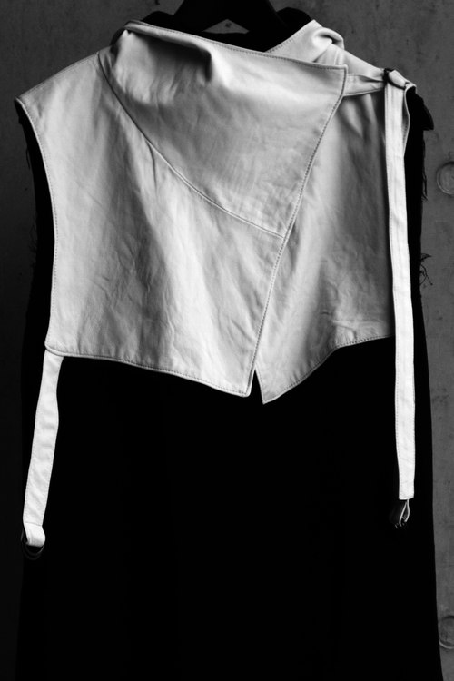
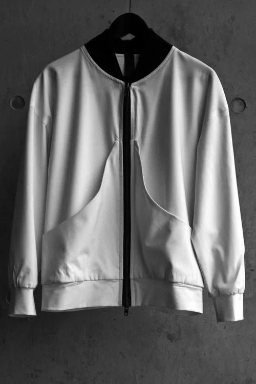
With a white and black color palate, these items find inspiration from Middle Eastern fashion and architecture. Beautiful cotton shirts and linen-lined jackets will find their way home in even the warmest climates and luxury details such as pig suede are placed in the most considered locations. I love the "Hood" which comes in white, lined in black, uses d-ring closures and has hand-treated leather details.  The white "Jacket 1" is another favorite piece which features a leather zipper pull, asymmetrical zips and collarless for more comfort during the sweltering summer months. 

Object Occult ships worldwide and all of the items are handmade and shipped from Shanghai. This is a label that offers quality over quantity and places intellectualism, form and style above all. I've been a big fan for the past few collections and the latest one does not disappoint. For more information and purchasing please visit Object Occult. 

-JRS

View fullsize 00 8.jpg
View fullsize 007.jpg
View fullsize 005.jpg
View fullsize oo 6 .jpg
View fullsize 00 4.jpg
View fullsize oo 3.jpg
View fullsize oo 2 .jpg
View fullsize ss15ed-1.jpg
Wednesday 04.22.15
Posted by Jeremy Schwartz
 

Don't Shoot The Messengers

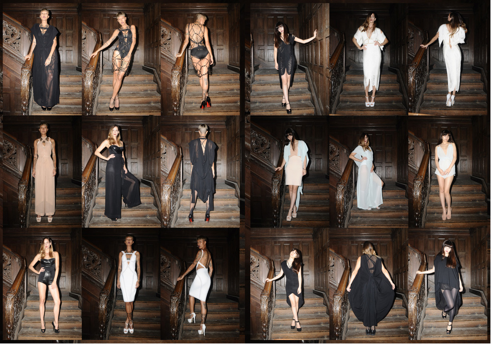
Over the past few years, Berlin-based fashion line Don't Shoot The Messengers (DSTM) has cast a very powerful spell.  The clothes and brand aesthetic exemplify so much of what The Brvtalist is about, that when we discovered the line, there was a feeling of pure elation.  Canadian-born designer Jen Gilpin is the couturier behind the dark, provocative and luxurious collections.  Together with her husband, photographer Maxime Ballesteros, DSTM has also contributed some of the most compelling and captivating imagery we have seen in the fashion world and beyond.  Drawing from a wide variety of influences and utilizing some of the most cutting edge designs and fabrics, Ms. Gilpin has created an incredibly unique body of work.  Further, one of the central design elements is the color black, so it was pretty obvious we wanted to talk. Below please find the Q&A where we discuss Ms. Gilpin's creative process, the brand's new store and the latest collection. 

*All photographs © Maxime Ballesteros 

The Brvtalist: I would like to talk a little about your creative process. For starters, we love that black is the core element of your designs, and they always carry a dark edge while staying very luxurious at the same time. What inspired you to create this kind of combination? 


Jen Gilpin: Yohji Yamamoto says it best, "Black is modest and arrogant at the same time. Black is lazy and easy - but mysterious. But above all black says this: ‘I don’t bother you - don’t bother me."  I love the combination of a tough, seductive and elegant woman.  My influences come from many places but a short list at the moment would be Art Deco and Art Nouveau, traditional Japanese design, Film Noir, Sci-Fi, Islamic art, architecture, geometry, fetish, nature, and the unconscious.
 

TB:  How do you approach each season? When dealing with monochrome palates, details are everything. What sort of things go through your mind when starting a new collection?


JG: I see the process as a sort of spiral or labyrinth - starting on the outside and working my way toward the center.  The big picture starts first with a feeling of the collection, then working in to find the details, lines, and shapes and finally at the end, standing in the middle of it refining the edges.  I have always loved craft and try to incorporate a new crafting technique into each collection.  Some element of handwork is always present.  Also, the beginning of a collection is always exciting - it starts with a feeling, and the process of discovering what that looks like is always interesting.  I love the dialogue between the body and the clothing that covers it. There is so much inspiration from the shapes and forms of the body. It is a play of expression of the body origin, describing what is underneath from what is on top.

TB: We were lucky enough to visit the original store when we were in Berlin this past fall. Can you talk a little bit about the new space? What did you want to do with it and how do you think it compliments your designs? 

JG: We are now on Torstr. 161 in Mitte. I love this street. It is full of all sorts of different businesses, and the shop front reminds me of a NY boutique. We painted the original pillars in front a shinny black and are starting a collection of vintage Rootstein mannequins to display the clothing.  Our studio is connected out the back and we have an amazing workspace with room to grow. It feels sometimes more like home than home.  In the boutique, we also have a changing display of Maxime Ballesteros prints that are for sale as well.


TB: Is the city of Berlin a big inspiration for you? Being from Los Angeles, we happen to love the contrast of sleek black design elements with the bright sunny landscape of our city. Do you think about the wearer's environment when designing? 

JG: The thing I love most about Berlin is the amount of space. The city is like a choose your own adventure book. It will not get in your way, and you can choose how you want to live here.  I try to design collections that can flow through one's life from day to day and night to night - from the foundation layer of body wear to the outer. Pieces that travel well and can work in any environment.  I only wear DSTM now except for shoes, which one-day will be part of the collection. When I try to wear other clothing now it doesn’t fit with my skin.

TB: Let's talk about the latest collection, S/S 15 - I noticed some white in there, which I love. What was the idea behind this collection and talk about your favorite pieces. 

JG: The S/S15 collection started with looking at the shapes and rope tying of Shibari. My favorite pieces are the rope harnesses; they are at once delicate and strong. I like a few lighter tones in Spring, although I still wear mostly black.

TB:  Maxime Ballesteros helps to provide the incredible images and environments you create.  I am interested in your working relationship and the dynamic between you two. 

JG:  When I met Maxime I was starting the first DSTM collection. We collaborated on the first shoot and have continued ever since.  Him, his photos and way of being are a huge inspiration for the collection and I.  We work together very often. I assist him on shoots and creative projects, and he assists me and shoots every collection.  

Thank you to Jen Gilpin for contributing these wonderful, insightful responses.  I believe we have found even more reasons to love the brand.  If you are fortunate enough to be in Berlin, please visit the new shop, located at Tor Strasse 161 Berlin DE-10115. For more information, collections and e-shop, go to www.dstm.co.  You can also find them on Instagram and Facebook.   We look forward to covering many more collections from one of our favorite fashion houses. 

-JRS 

View fullsize 000100010014 (glissé(e)s).jpg
View fullsize 000100020009 (glissé(e)s).jpg
View fullsize 10487448_785649088148896_8941841474185898759_n.jpg
View fullsize 1557538_785649394815532_7223532127572560608_n.jpg
View fullsize DSTM_lookbook_AW15_WEB_BIG-10.jpg
View fullsize DSTM_lookbook_AW15_WEB_BIG-6.jpg
View fullsize DSTM_lookbook_AW15_WEB_BIG-17.jpg


Wednesday 04.08.15
Posted by Jeremy Schwartz
Comments: 1
 
Newer / Older