Eyewear is one of the most telling items a person can wear. What you choose to put on your face says a lot about you. There are some brands that represent pure functionality, some that represent pure luxury and others that represent something much more. VAVA Eyewear falls in to the last category. The brand's conceptual approach not only represents fashion, but materials, culture and perhaps even an ideal of the future. When we came across these striking designs, they immediately resonated with us. The unisex frames were bold and like nothing we have seen before. We also noticed the company referenced architectural forms and associated the line with Detroit, Berlin and their techno legacies. An email was sent to the brand so we could find out more. Their founder and creative director, Pedro da Silva, graciously responded and here's what we discussed:
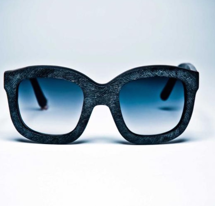
VAVA Eyewear Summer 2015
The Brvtalist: Let's start from the beginning. What was the inspiration for creating VAVA Eyewear? With so many eyewear brands in the field, what did you feel you had to say or show that maybe others don't?
Pedro da Silva : I always had a keen interest in Minimalism, the interface of art and fashion, and Bauhaus. I’ve always liked basic shapes, and admired a lot artists like Sol Lewitt, Malevich or Josef Albers. My keen interest for the Bauhaus movement and minimalism goes a long way back. I wanted to develop an eyewear collection that follows the same minimalist and architectural standards. Ultimately, the aim of the brand is to achieve a contemporaneous functional look, whilst being simultaneously conceptual and timeless.
On the other hand I have been long fascinated and inspired by the Detroit techno scene and the city's post-industrial evolution. VAVA’s mission is to represent the man in control of the technological world whilst looking ahead of himself also. Everybody at VAVA lives by this philosophy, reinforcing their belief in this vision.
Finally, at a time when fashion is omnipresent and somehow random, we at VAVA believe it is necessary to re-orientate and to reacquaint what fashion should truly represent: A return to the essential requirements of design and quality.
TB: Who designs the VAVA line(s)? Talk about the creative process and what you try to do with each collection.
PS: I’m the creative director of VAVA and I collaborate with 2 eyewear Designers: Giordano Cazzola and Beate Leinz. Giordano Cazzola, a multidisciplinary designer working in the eyewear industry, is based in Milan. Beate Leinz is currently based in Berlin and she worked previously as eyewear designer for Prada in Italy over 15 years.
I do not usually follow trends and fashion. I believe in style, and style never changes, just evolves. I see it more as a continuous evolution. Actually, I like to think more about evolution, questioning / reflecting and digging / deepening. I like consistency and particularly enjoy works that are representative of something bigger. Another interesting aspect of our project is that our mood is visceral, granting veracity to the project and therefore to our collections.
TB: I love the links to Detroit and Berlin. How did you decide to associate the brand with these two cities and what do you think they contribute to the aesthetic or ethos of VAVA?
PS: As previously said, I have been long fascinated and inspired by the Detroit techno scene and the city's post-industrial landscape. Detroit, once a symbol of industrial prosperity, dramatically collapsed and was forced to re-invent itself to ensure its survival. The techno movement emerged as a significant step in this process of rebirth, and was part of a movement towards the creation of a Techno City, the city of the future. I wanted to create a label that would both embrace the highly conceptual language of machinery (including mechanic sound) and the arts. When I decided to create my own eyewear label I moved back to Germany. Berlin being, like Detroit, a post-industrial city with strong links to Techno was the perfect spot.
VAVA Eyewear Summer 2015
TB: Another thing I noticed is the relationship to techno. Juan Atkins is one face of the brand. How did that collaboration come about? Do you find that there's a connection between techno music and VAVA, or even fashion in general?
PS: I love music and the label has a great connection to music. We’ work with Juan because he is a high profile artist and a founder of a genre that has deeply influenced the story of electronic music. His music is a form of experimentation that emphasizes the balance of man and machine, the same artistic basis at the core of VAVA philosophy. Fashion and Music industries have many things in common and often go hand in hand.
They equally separate and group people which can be immensely revealing. People dress distinctively to express affinity with a group or way of life. On the other hand music also has a big impact on what people wear. They share the same type of language. A language which tells a story about the person who wears/hears it "Clothes and Music is an effortless expression of communication that we all understand".
Juan Atkins for VAVA Eyewear
TB: Talk a little bit about the idea behind the Black and White collections. Also, I've noticed the future is an ongoing theme of the line. Do the lines represent two different ideas of the future or are they meant to coexist in the same world?
PS: VAVA imagines a future between two contrasting extremes, black and white. White future is simplicity, cleanness and purity. Black future is darkness, decay and underground. To represent these 2 extremes VAVA created the WHITE and BLACK labels.
TB: Let's talk about the latest collection. What was the idea behind it and talk about some of the details you are most excited about.
PS: Our very new optical line of eyewear will be launched in June along with new SUN styles, some of which have a very powerful techno look. I like to think that, whilst ensuring consistency with the brand’s DNA, these new models are also about evolution, questioning /reflecting and digging/deepening. At VAVA we take particular pride and fulfilment from work that we feel will take the brand and our ethos to the next level. On a different note, the experience gained with the first collection allowed us to fine tune “invisible” details too, turning VAVA into an even more “techno/technological” brand.
TB: What's next for VAVA?
PS: 2015 is the thirtieth anniversary of Juan Atkins record label, the Metroplex. The bond is upholded by the launch of a special eyewear model realized in limited edition in only 300 enumerated pieces. Specially in this case the essencialities of the model are in sync with the sperimental and space age sounds of the music of Detroit’s artist.
Thank you to Pedro da Silva for contributing these incredibly insightful responses. The Brvtalist is always fascinated by brands that represent so much more than just fashion, but have a focused ethos and mission to go along with it. VAVA is a unique line that infuses the worlds of fashion, music, culture and design and we applaud them for this. For more information, please visit the official website.
-JRS
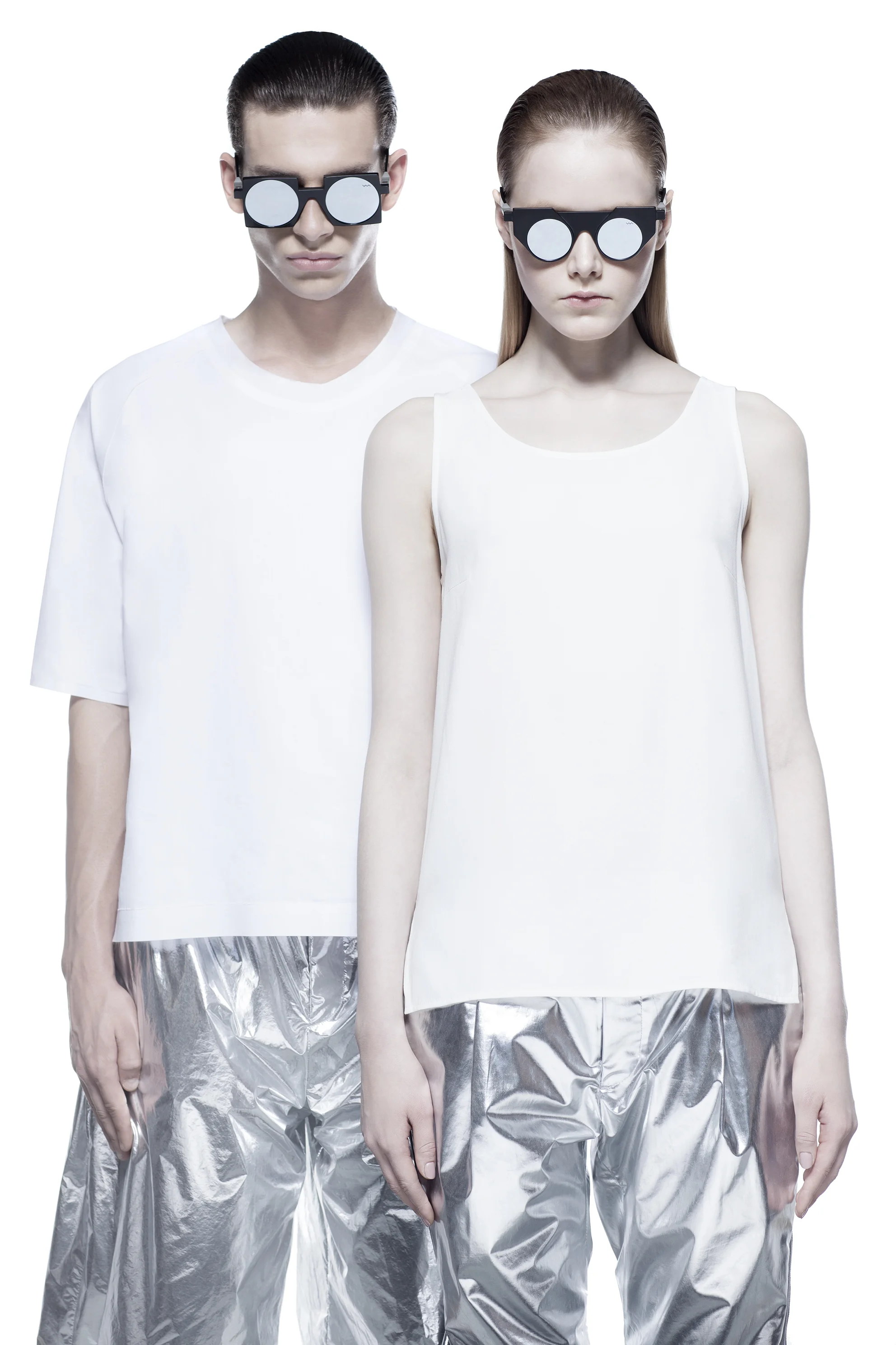


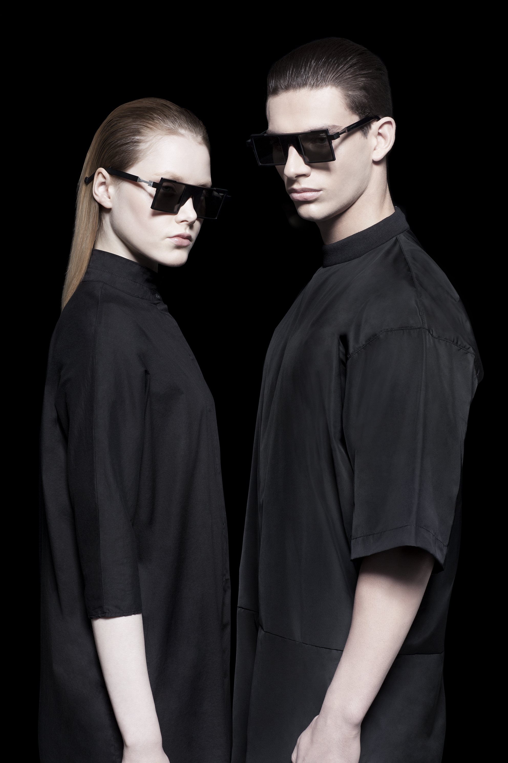

Pictured: Opitcal and Sun line from VAVA Summer 2015
Pedro da Silva - Founder/Designer